

Do you know what’s worse than bad coffee? Chaotic visual communication! This is why taking care of your graphic charter is essential for your business. It is to visual identity what the primer coat is to paint: it prepares the surface so that your message can be fully expressed. If you don’t yet have a graphic charter or don’t see its importance, here are some reasons that will convince you otherwise.
What is a graphic charter and why is it important?
The graphic charter is a document that lists all of your company’s graphic choices. It defines the standards to follow, the fundamental rules which define the visual identity of the company. Basically, it’s a common vision of the company’s values in terms of visual communication.
This may sound complicated, but it’s actually very simple. The graphic charter indicates how to use the logo (or logos), its minimum size for printing and for the web, colors, typographies, visual universe, etc. Taking care of your graphic charter also ensures graphic consistency for the creation of all media.
How to create an effective graphic charter?
The logotype
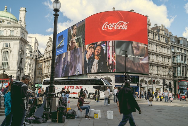
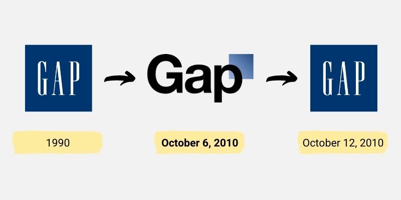
The logo is the first stone of your graphic charter. It must be presented in all its forms of use, with good practices to follow. It must be clear and readable, without being distorted or modified. You should not play with size, colours, typography or orientation. In short, don’t do anything that could alter your logo.
The typographies
You must define the fonts, sizes and weights of your titles, subtitles and body text. Headings should be large enough and readable, while the body text should be more classic and easy to read. Choose a font that matches your business image.
The colour scheme
Define the colours of your logo as well as those of your website and their use. Choose colours that represent your company values. You can create a colour chart ranging from the main colour to a lighter or darker colour depending on the use (bright background, information point, ect.).
The visual universe
The visual universe includes everything that accompanies your image and makes it homogeneous. Emphasise iconography, images, illustrations, photos and give them a consistent mood with the image of your company.
The benefits of a graphic charter for the company
Strengthens the brand image
A coherent and well-designed graphic charter helps strengthen the brand image of your company. It helps convey a professional and serious image to customers and partners.
Ensures visual consistency
The graphic charter ensures visual consistency in the creation of all communication media. It helps avoid graphic errors and inconsistencies that can harm the company’s image.
Differentiate yourself from the competition
A well-designed graphic charter allows you to differentiate yourself from the competition. It allows you to create a unique and recognisable visual identity that stands out from that of competitors.
Facilitates the creation of communication supports
The graphic charter saves time in the creation of communication materials, by guaranteeing visual consistency. It allows you to create graphic materials that are easily recognisable by customers.
Unites employees
The graphic charter helps unite employees around a common vision of the company’s visual identity. It helps create a strong corporate culture and strengthen team spirit.
Improves the quality of communication
The graphic charter helps improve the quality of company communication by guaranteeing homogeneity and visual coherence. It makes it possible to transmit clear messages that are easily understandable by customers.
Facilitate brand image management
The graphic charter makes it easier to manage the company’s brand image. It ensures visual consistency on all communication media and avoids deviations that could harm the company’s image.
In short, taking care of your graphic charter is essential for the visual communication of your company. It makes it possible to strengthen the brand image, ensure visual consistency, differentiate yourself from the competition, facilitate the creation of communication supports, unite employees, improve the quality of communication and facilitate communication. brand image management.
Common mistakes to avoid to take care of your graphic charter
Copy competitors
Of course, it is important to know market trends, but your graphic charter must be unique and representative of your business. It must be consistent with your visual identity and your values.
Create a graphic charter that is too complex
To take care of your graphic charter, it must be simple and easy to understand, so that everyone in your company can apply it easily.
Not adapting the graphic charter to all media
It is important to take into account the different communication media for which the graphic charter will be used (print, web, social networks, etc.). Dimensions, resolutions and colors may vary from one media to another one. Make sure your graphic charter is suitable for all media.
Not taking into account the opinions of stakeholders
The graphic charter is a document that involves several stakeholders, including employees, customers and partners. It is important to take into account everyone’s opinions so that the graphic charter is accepted and adopted by everyone.
Not updating the graphic charter
The graphic charter must be regularly updated to be in line with the evolution of the company. Logo changes, new products or services, new partnerships, etc. must be taken into account in the graphic charter. An outdated graphic charter can harm the company’s image.
Not calling on professionals
Do not neglect the importance of calling on professionals to create your graphic charter. It may seem expensive, but it’s worth it in the long run. The experts have the experience and skills necessary to create a graphic charter that corresponds to your business and which will be effective in visual communication.
Some examples of careful graphic charters
Starbucks
Starbucks is a coffee company, known for its specialty coffees and food products. The company’s graphic charter is available on https://creative.starbucks.com/.
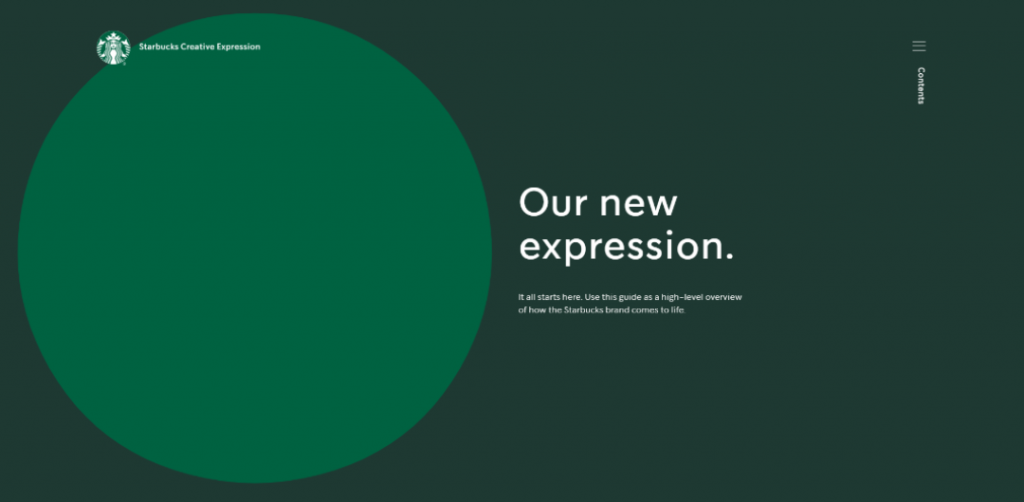
We like: Its variety and consistency. Starbucks has managed to create a strong brand by using recognisable graphic elements, such as the colour green and the mermaid logo. Starbucks’ graphic charter is also flexible, allowing the company to adapt to different formats and media.
Spotify
Spotify is a music streaming platform that allows users to access a wide variety of music online. Spotify’s graphic charter is available on https://developer.spotify.com/documentation/design.
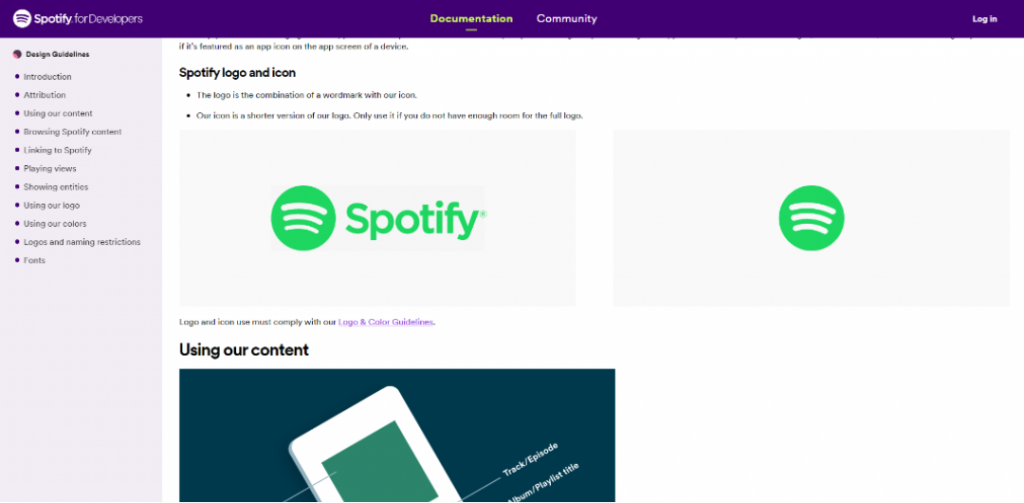
We like: Its minimalism. Spotify’s graphic charter is very simple and easy to understand, which is essential for a company that targets a global audience. Spotify’s graphic charter is also very consistent, which strengthens the company’s brand image.
Redbull
Red Bull is an energy drink company that is also known for its involvement in extreme sports. The company’s graphic charter is available on https://www.redbull.com/int-en/energydrink/contact-legal-aspects.
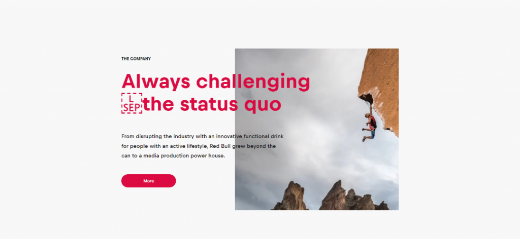
We like: Its dynamism. Red Bull’s graphic charter is very creative and stimulating, which perfectly matches the company’s brand image. Red Bull’s graphic charter is also very flexible, allowing the company to adapt to different formats and media.
Slack
Slack is a communications platform for businesses that allows you to collaborate, share files and chat in real time. The company’s graphic charter is available on https://brand.slackhq.com/.

We like: Its modern appearance. Slack’s graphic charter is very clean and minimalist, which perfectly matches the company’s brand image. Slack’s graphic charter is also very consistent, which reinforces brand recognition among users. The combination of purple colour with creative illustrations makes Slack’s graphic charter unique and memorable.
Lego
Lego is a Danish company that produces construction toys made from colorful plastic bricks. The company’s graphic charter is available on https://www.lego.com/es-es/aboutus/lego-group/the-lego-brand

We like: Its playful aspect. Lego’s graphic charter is very creative and fun, which perfectly matches the company’s brand image. Lego’s graphic charter is also very consistent, which reinforces the brand’s identification with consumers.
Conclusion
In short, taking care of your graphic charter is a key element of your company’s visual communication. It allows you to strengthen your brand image, ensure visual consistency and differentiate yourself from the competition. It should be simple, easy to understand and representative of your business. Do not underestimate the importance of calling on professionals to create your graphic charter.
At LUNDI MATIN, we are experts in creating graphic charters. Contact us to obtain coherent and professional visual communication.
